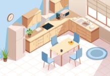
Every so often, we need to push ourselves to rethink how we approach a design, and then look for new ways to reinvent ourselves from the norm. This issue I want to explore the concept of planes. When you look at a space, always ask yourself how you would break down that space into its basic elements and what would be the striking architectural feature you’d want to implement into the space? Try to look beyond the decoration such as colours and finishes, and look at space for what it is. Then see how you can design a space that sparks life and beauty. Learn to look at space in terms of its vertical and horizontal plans. In every space, there will always be three major planes – the floor, the ceiling and the walls. Look at each plane not in isolation but as an integrated set, and see how this can be interpreted to determine the design of the space.
TAPERING THE WALLS
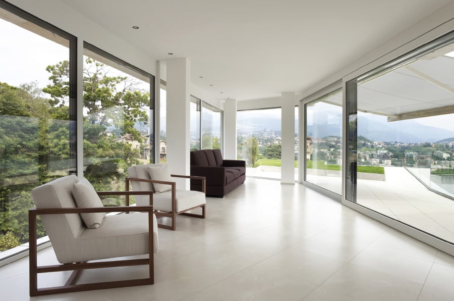
In this example, the main emphasis is on the tapering effect of the walls. By allowing the walls to taper inwards, it creates a focal point effect, which leads our attention towards the end of the room. Once our attention is drawn towards the center of the room, we then look beyond the space towards the background. This then draws our field of vision back again into a panoramic view to experience the expanse of space.
By introducing full height windows, the vertical plane suddenly disappears to bring more attention to the horizontal features of the tapering ceiling and floor design. By creating a transparent vertical plane, the space creates an illusion of weightlessness as if the ceiling were floating above the ground. This further enhances our experience of the architecture, as we are given the sense of flight over the landscape below.
When you look at the architecture of your home, don’t be confined to the walls or planes surrounding you. Look beyond the space and see how you can integrate the internal confines of your home to the exterior.
Emphasizing the profile
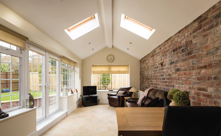
The next design emphasis is to look within the room itself and at how the profile of the walls can affect the design appreciation of the space. In this example, the main emphasis is on the main feature wall at the end of the room. By extruding the 5 planes of the outline shape, we are drawn towards a tunnel design effect. So, unlike the first example where our attention is drawn towards the center and then pulled back to the panoramic view, this design is one directional where we are focused solely towards the end of the room.
Therefore, to break the monotony of the tunnel effect, we need to think in an asymmetrical manner, and this is done through materials and features. By introducing a brick wall feature wall to the right, it allows the right plane to act as the backdrop to the left plane. This gives the concept of yin – yang, heavy – light, solid – empty, or simply the concept of opposites.
By creating a solid feature wall on the right, it allows the left glass wall to live in symbiosis within the space. Similarly, the solid floor below is matched with the skylight ceiling above to give this opposite effect, which in turn creates a connectivity with each other.
When you are designing a room with a tunnel effect, look at ways to treat the walls by creating opposite features between each of the opposing planes. Through a simple design gesture, we are able to create an interesting play of experiences within this tunnel design.
The Vertical Anchor
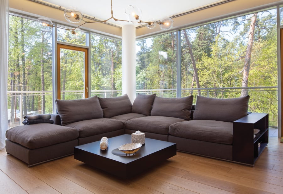
The final design emphasis when working within planes is to introduce the concept of an Anchor. The Anchor is my term for a design element that pulls the entire room together, and becomes the central focus of the space. In this example, the similarities with the first example are vast, but there is a main difference, which is the position of the main anchor. While this example shares the same attributes such as the floating ceiling, the full height glass and background effect, the central focus is the dominating effect.
Our attention is not drawn towards the panoramic view behind, rather, the view acts solely as a backdrop to the center of attraction, the Anchor, which is the central column and L-shaped seating arrangement. The secret in determining how we experience a space is understanding what we want the focus to be on, and how we want to experience the space. Do we want to focus on the interiors? Or do we want to pull the exterior landscape into the room, or do we want to bring more attention to the different planes of the room?
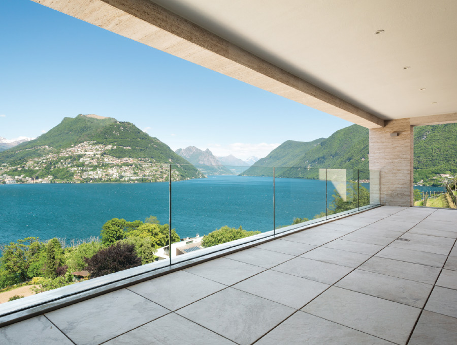
In the example here, while we have this beautiful view in the background, our attention is again anchored to the solid column at the end. While our attention is drawn towards the landscape, we are always pulled back to the foreground through the monolithic anchor. If we wanted to pull away from the foreground, the monolithic column should take on a smaller, lighter shape to allow the horizontal planes to dominate the space rather than the vertical.
When designing your house, always think of your rooms in terms of its planes, and how the use of vertical and horizontal planes can affect the way we perceive the space. Look at vertical planes in terms of foreground elements and horizontal planes as background elements. How we combine the planes will then determine the design effect we create within the space.


