Designing offices requires a key sense of planning skills, where the designer needs to look at functionality, practicality and social interaction rather than personality. The key element to understand in office design is that the space needs to cater to a wide group of individuals, each with their own preferences in colour, aesthetics and space. To attempt to design for a certain group’s preference may cause other groups to react positively or negatively. When designing an office space therefore, it is smarter to design for the community at large using a neutral colour palette, and paying particular attention to circulation and movement, rather than trying to please just one group.
COLOURS
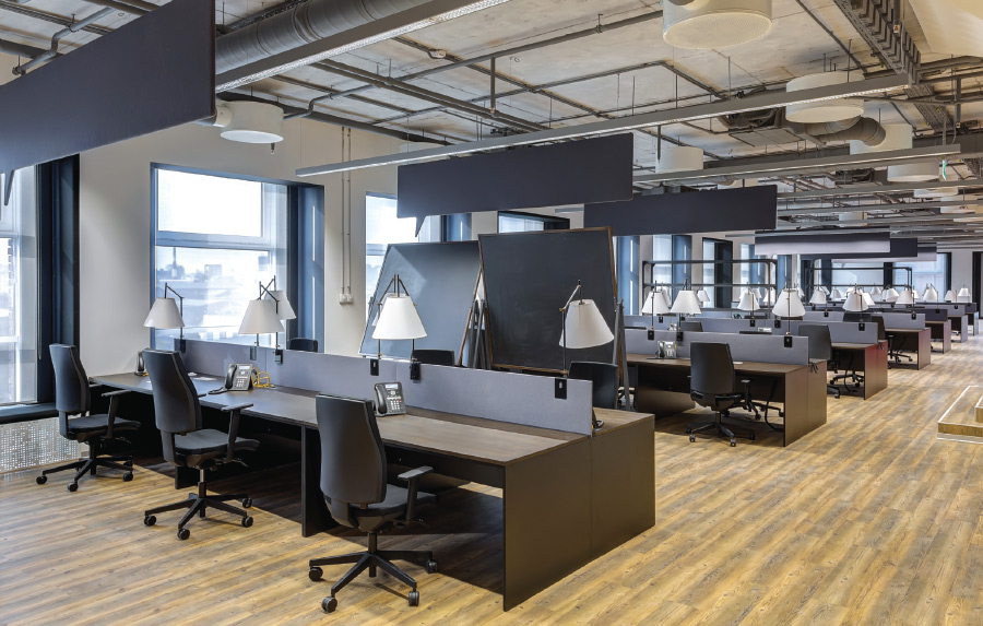
So how do we define a neutral colour palette? First we need to look at colours that can generally be accepted by everyone. This means colours such as off-whites, beiges or greys. Typically, these colours are controlled through the level of contrast and brightness to achieve an acceptable level of composition for the interior design. Such colours also provide the perfect backdrop to pick out any primary colours you may add on later, depending on each person’s individual preference.
While colour appreciation is a subjective topic, primary colours such as reds, yellow and blues are often too powerful, and can be overwhelming for most. The next level of colours will be your secondary colour palette consisting of oranges, greens and purples, which offer a more toned-down effect. These colours offer a connotative expression, as they spark a memory or emotional response usually associated with one’s past experiences. For example, orange can remind one of the dusk or autumn, while green gives the calming effect of landscape, stability or even the beginning of something new.
So when selecting colours for the office, always remember that different colour tones can cause different emotional responses in different people.
- Try to avoid primary colours as they tend to create conflict due to the emotional reactions they evoke.
- Always start with neutral tones to set the base layer for whatever secondary colours you choose to include later.
- Secondary colours can be selected based on company logo or the connotative response you want to achieve for the general office.
CIRCULATION
The next item is to look at is office layout. The key to a properly designed office is to create a comfortable circulation route and to avoid ‘dead ends’. By dead ends, I refer to table arrangements whereby movement is restricted resulting in stagnation around the office. This can be seen in offices where tables are placed in a row, and only the person using the last table would ever go there. This creates tension in the office environment, as it causes the individuals at the end to become isolated from the rest of the group, as that would be the least interacted table.
Depending on the size of the office, there are various ways to lay out the table arrangements. For mid to large-sized offices, my preference is to integrate a race-track concept, whereby the main circulation space is located around the open office hall or individual rooms.

In this concept, the main entry is located at the center of the building with the windows along the building perimeter. Therefore, by locating the individual offices towards the building core it allows the natural daylight to extend deeper into the office which helps improve lighting efficiency, but also mood. With the circulation corridor located in between the offices and the open office floor, the key is to arrange the tables such that you create zones or groups (Option A) so that regular interaction between workers is promoted. Rather than Option B, where the tables are arranged in a row, which tends to create segregation and individualism.

The other arrangement is a total race track design, whereby the offices are located along the perimeter of the building with a pathway circulating around the main office hall. This helps create a complete open space plan design where zones are set up in groups of 4, with secondary pathways crisscrossing the main hall to further increase interaction. The reason for interaction is to facilitate team building through interaction, discussion and conversation.
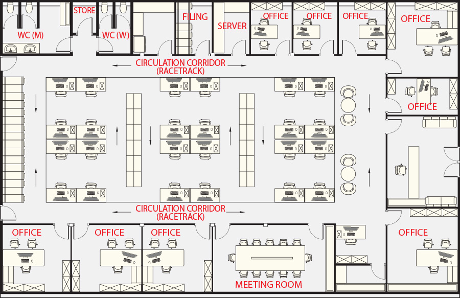
Also, by arranging the tables where the backs of each employee are to each other enforces the notion that you rely on your team member to watch out for you and vice versa. From a management viewpoint, it also allows one to monitor the staff with a single glance to ensure productivity is at its maximum, and no individual is idling on social media.
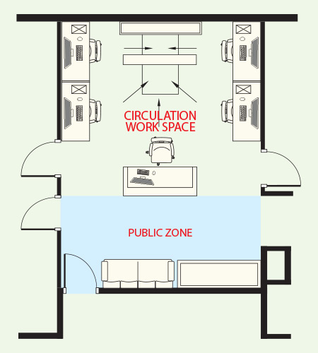 For smaller offices, where space is not a luxury, I like to work based on the concept of private and public spaces. Based on this example, I have reduced the amount of corridor space by locating all tables to the walls to create a centralize filing station that is shared by the receptionist and staff. The front of the receptionist is then described as the public zone. So rather than the conventional arrangement where you enter the office to greet the receptionist before moving into the rest of the office, by combining the receptionist into part of the overall office, we can fully utilize the circulation space as usable work space.
When designing the office, always look at these 2 key criteria – the need for a neutral colour tone and the right circulation. When you get these two things right, you will find that the atmosphere of the office is more interactive, more cheerful and much happier.


