Ever wonder how too much of a good thing can be a bad thing? When it comes to design, it is always a two way street or a dialogue between the designer and the client. And once in a while, we will encounter a situation where we ask ourselves: is what is being asked too much? And how do we treat it in a manner that tones down the client’s needs, yet make them satisfied with it?
Before we proceed further, it is always important to take note that design is a subjective topic, and every person has a different tolerance level of appreciation. But do keep your eyes open when you design your home. Always remember not to go overboard, even though you may think it is a great idea. Moderation is a good thing!
LIGHTING CONTROL THE LEVELS
Lighting is an essential element in design, but we need to understand that light is a mood-changing element. Too much or too little of it can affect how we think and feel; and the type of colour used can even create distortions in the mind.
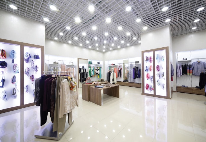
So in this example, the classic mistake was to think that the more light we had, the better it would be for the retail environment. First, the use of a backlighting on the wall-mounted cabinets creates a shadow on the product you are trying to sell; so rather than highlighting the product, it is thrown into a backlight shadow. The remedy should have been to use ceiling mounted spotlights in a warm colour to create focus of attention along the walls and to bring out the sparkle of the products.
The general lighting is overwhelming due to the monotonous arrangement and the overpowering white light. Ideally, the lighting should have been arranged to create different lighting levels throughout the store. Complimenting the general lighting with ceiling spotlights would help the consumer focus their attention onto the products rather than being blindsided from the overhead lamps.
I LOVE COLOURS BUT…
Everyone loves colours, but sometimes a little too much can become overbearing to anyone. In this scenario, we have a room with four distinct features, mainly the walls and ceilings painted in three different colours and the floor in a different texture. It is due to the collage of all these four elements merging at the same time that we get a visually-distorted feel.
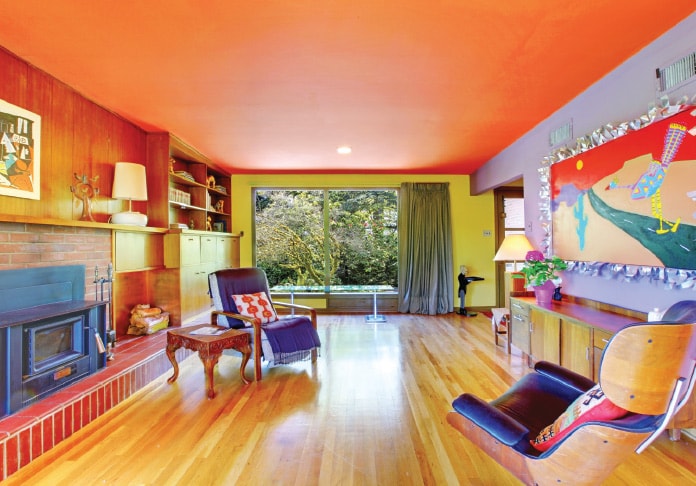
To work through this situation, we could design based on our level of colour tolerance. The first option would be to whitewash the ceiling and backwalls, which allows the violet feature wall to stand out prominently. The second option up the ladder of tolerance would be to paint the backwall the same colour as the ceiling to create a continuity, so visually we don’t see a mixture of colours but rather zones. This creates a violet wall on the right, an orangey hue wall and ceiling in the middle and the timber panels on the left, giving a sense of order to the room.
When we deal with colours, having everything painted is not the issue we need to be concerned with, but rather how we treat the visual aspect.
TOO MUCH OF A WALLPAPER FAN
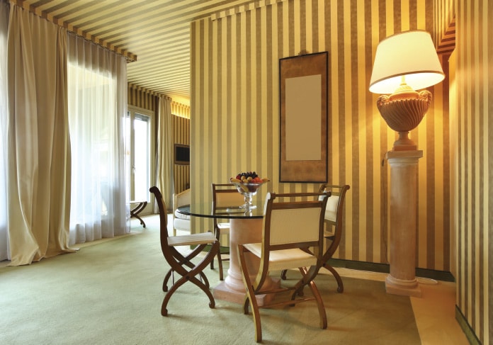
Wallcoverings are great substitutes for feature walls or general wall treatments. Even in apartments where wall coverings are used extensively to the point of confusion, there is still a bit of appreciation for it. But when we have an oversupply of wallcoverings, where they extend over and beyond their boundaries onto even ceiling zones, there has to be a limit. In this example, while the design was done quite tastefully to achieve a level of cosiness, the use of wallcoverings is overwhelming to the point where you feel as if you are living within a wrapped-up boxed present.
THE STONEY LOOK
Natural finishes can help add a touch of sophistication and a rustic feel to the interiors, but the selection and scale of its use can have a counterproductive effect. Consider using natural stones solely as feature pieces, such as a specific wall or sculptural floor effect; but avoid the overuse of the material.
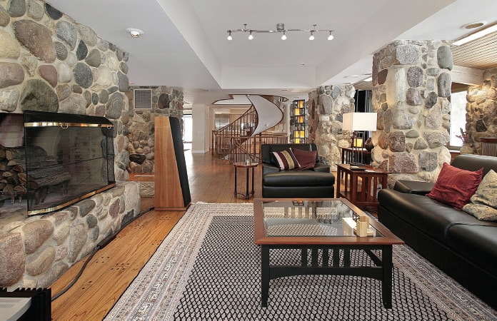
Always remember that every material has a visual massing to it. Like how fabrics are used to soften walls and facades, stone creates a heavy feel to the room. When used in excess, it creates a masculine effect within the space, making anyone within feel weighted and under pressure.
THE FLORAL EFFECT

One of the greatest disciplines a person may adopt is to know when something is in excess, and knowing when to stop. The example here has been chosen solely to illustrate the excess use of floral patterns. As a carpet feature, it helps to set the base tone for the flooring to match against the yellow wall-covered walls; but to accentuate this floral pattern further, with drapes over the doors, tends to complicate the visual arrangement of the scene.
First, the reddish floral drapes conflict with the yellow background, as the tone is too similar to the floral carpet pattern. This colour similarity blurs any defining line between the floor and wall, thereby creating visual confusion. By introducing an element of similar colour and tone, our eyes are fixed not on the floor but on both floor and drapes together, which then overwhelms the entire perception of the room.
The next time you engage yourself in selecting materials for your design, always remember to select in moderation. Never over or under-use any materials, and always look at how such materials are used. Try to avoid crossing planes such as margining walls and ceilings, walls and floors or even planes across the room, as too much use of any particular item over multiple planes tends to have an overwhelming effect for the space.


