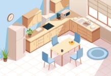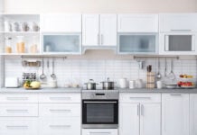
Everyone has a different perception of how colours should work, and whether or not you agree will differ from one person to the next. So, rather than looking at colours individually, let’s look at colours as tones, and see how the pairing up of different colours can create an artistic language in itself.In this example, the first thing you will notice is the use of the colour red along the walls, but while attention is drawn towards the colour, we might miss out on the organization of the kitchen, and the relationship of one area to another. Strip away the colour aspect in the design and you will start to find three basic design elements.
First, the C-shaped counter creates a solid base that unifies the principle of the kitchen by forming a triangular work arrangement between the sink, stove and work counter. Next, the central placement of the stove creates a mirror image along the wall dividing the space into two halves (dry and wet). Finally, the placement of the oven-stack versus the horizontal storage stack helps introduce visual lines to break up the monotony of the kitchen.
When we take away the idea of colours and look instead at tones as a medium of architectural language, we can go deeper into analyzing how a space is designed and how it affects us.
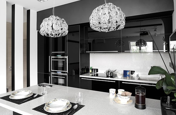
In this next scenario with a black and white concept, by removing the concept of colour and focusing instead on tones, we start to see a different picture. In this case, the lighter-coloured tones are used for the horizontal surfaces, while the black-coloured tones are used for the vertical ones. This makes use of tones to accentuate the difference in planes.
The next element that stands out are the chandeliers, which mirror the plate setting on the island table; these create a link between the foreground and the background.
So when we start to observe a space, try not to get too distracted by colour and instead, start to appreciate the space through the placement of objects within the space, and look at how they relate to one another.
There is no better place in the home to let your guard down than the bathroom, so why not design it to be fun and unique at the same time. Regardless of the size and shape of your bathroom, you can create features within the space to liven it up. Looking at the example here and ask yourself: what is the first thing that strikes you? Probably the elliptical bathtub. But ask yourself if that really is the key feature that makes up the feel of this bathroom. While it may be a central feature, it is definitely not what makes up the bath area.
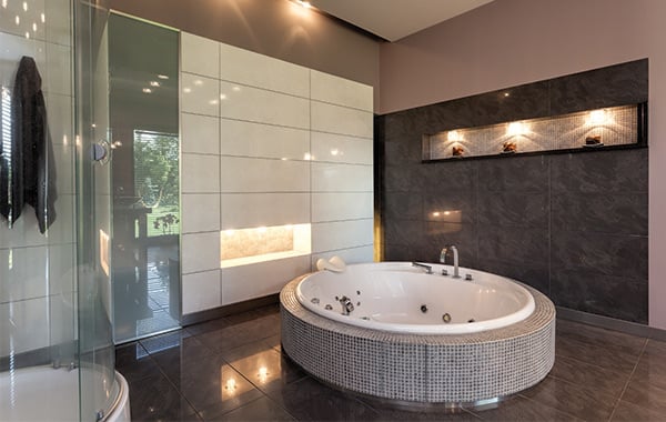
Look deeper and you will find two key elements that can be integrated into any bathroom. First is the use of lights; playing with ambient lighting using display vignettes and portals gives depth to any room. The next is the use of materials; by creating a seamless wardrobe system in white, it helps balance out the grey effect feature wall on the right to bring about a sense of diversity, rather than a monotonous tile design.
When doing up a room, the key is not to focus attention on a single point, but rather multiple points, in order to heighten the sense of adventure and appreciation for the space.
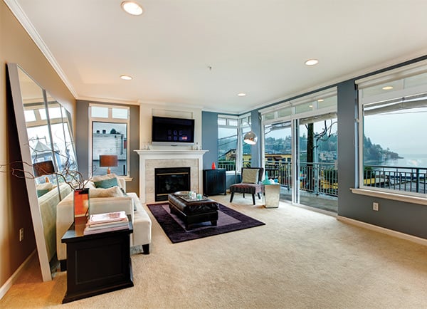
There is no better way to create a fresh new look than by doing something out of your comfort zone. So once in a while, do something so different that you amaze yourself. Like most of us, we are used to regularity, symmetry and monotony, as it is considered ‘safe’. So let’s push past this comfort zone and see what you can live with.For example, in this living room, the most obvious breakaway is the play on colours, where the room is split into two, through the use of a blue and brown tone concept. Being quite unorthodox in the use of the colour palette allows the creation of an invisible defining line between the background and the foreground.
The next observation is the use of objects to skew the concept of scale. By introducing two large mirrors on the left, it creates a distorting effect, as the human scale is suddenly distorted, creating this illusionary appeal to the room.
However, despite these design anomalies, the conventional setting of the fireplace, seating arrangement and picture window all help pull these anomalies together into a unique setting that seems to fit quite well. Through the confusion comes a unique setting that creates its own architectural language. Regardless of what comments are received, this space will no doubt reach the same conclusion – that this is a new way to visualize how a home can be decorated.
The next time you start to look at a room or space, look deeper into the basic design intentions, and from there you can start to appreciate how you can design for a higher level of appreciation. Look into the use of tones rather than colours, the use of backdrops and how to work the foreground, and understand that architecture is a language. How you experience any space depends on how creatively you mould that space.


