Have you ever wondered what it would be like to think up an idea and develop it from words into physical form? To some, describing a scene can be an tedious task, but to convey what you want within a space and translate that into physical form takes all the challenges of design to a new level. Once in a while, we encounter a project that demands such unique criteria that all the years of experience gets pushed to the limit, for us to be able to come up with a single thought that embraces these “emotions”.
Recently, I had the privilege to conceptualize and work on just such a project. The key criteria with such an assignment would be to develop a space that embraces the concept of seduction and exclusivity. To create a setting that feels posh yet inviting, and to maintain an elegant feel ensuring that such emotions are captured in the experience of the space. So where does one begin in such a case, or the more important question is how should one begin?
First, we need to understand our Design Palette, which is divided into shape and form, materials, colours and lighting. With every shape comes a specific emotion. For example, rectilinear forms provide a rigid experience, with all the lines clearly defined and everything structured in an orderly fashion. Curves and circles on the other hand tend to offer the opposite effect, one of playfulness.
DEALING WITH CEILINGS
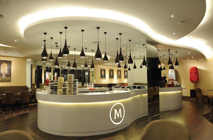
In this project here, curved forms are represented in the ceiling and floor design, and accentuated with a central counter that mirrors these forms. This creates a three-dimensional effect that transcends all the three planes (floor, ceiling and counter) giving the user a sense of liveliness, free-flow excitement and the inclination to move around the space. If you were to think about it, if instead of curves a rectilinear form was used for the ceiling, the effect would be the total opposite, and would emit a sense of rigidity instead. Furthermore, the use of an infinity ceiling design helps create feelings of embrace and seduction.
DRESSING THE WALLS
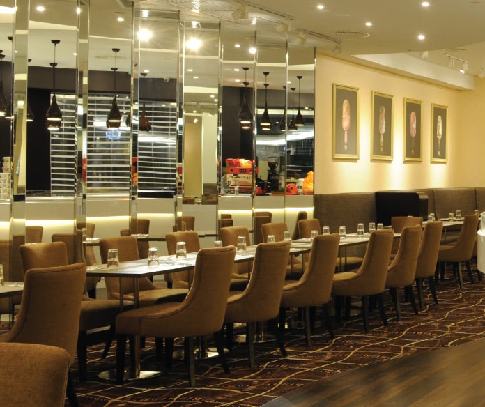
The next stage is to highlight the vertical surfaces of walls. In this case, signature infinity mirrors were introduced to create a sense of space, but also to capture an idea of multiplication. Key features have been used here to anchor specific walls either as graphic pieces, or hung with signature artwork to draw one’s attention to specific corners of the area.
When we have established the notion of playfulness and seduction, we can up the ante by creating feelings of exclusivity and elitism. But… we also want to create an inviting setting. To do this we need to understand our audience and their expectation of the space. Remember, to fully appreciate any space, one needs to tap into the key senses of sight, touch and smell. The visual element has already been taken care of through the forms of the space, but touch is represented through the materials and colours that are used.
We need to create the mood, therefore an extensive use of dark brown tones has been applied for the façade. This creates a relaxed feel, while the internal walls are lined with an exclusive wall covering mural imprinted with the signature gold hue, but done with a matte-texturized finish to soften the feel. The flooring is comprised of a mixture of timber and carpets to further heighten the ambience of comfort and decadence. Even the selection of the carpets was done to capture the playfulness of the product, through the intertwining ribbons and curves.
To really capture that feeling of elegance, we increased the grade-quality of the flooring materials to produce a soft feel. We were looking to create a flow that suggests “floating on air” so the experience becomes a totally stress-free one as we move through the space. It is important to note that how we feel as we move through a space will affect how we experience the space.

IT’S ALL IN THE LIGHTS
The final element in the puzzle is the use of lighting. Through proper use of lights, we are able to highlight key areas of the space and determine how to set the experience. By integrating a collage of spotlights, wall washers and ceiling washers, an array of lighting settings are created. In this scenario, the main lighting features include the use of “drop chocolate lights” to highlight the importance of the central counter feature. Ceiling washers are used to highlight the curvilinear ceiling form, but more to demarcate the seating areas from the central service zone.
Spotlights are further utilized to pick up key features along the walls or floor, thereby setting different themes throughout the space. And finally, the backlight counter lights highlight the prominent feature of the main counter.
HIGHLIGHT THE “CORE VALUES”
Whenever you want to describe an idea or concept as a Design, it is important to understand the core values of what you want to achieve, and draw out a road map to achieve your goals. Whilst it can be mind-boggling to develop a physical structure based on an idea that originates from just words and key phrases, it is not impossible. The key is to understand what each keyword represents, and ask how each can be achieved through our Design palette.
Always remember that an experience is determined by what we see, touch and hear. So it is most important to look at the physical space, then make a decision on how we want to design the space to spark off those emotions, which in turn develops into that feeling as described in the key words.
Design can be a fun and exciting skill but it can also be frustrating as everyone experiences a space differently. The secret is to think and actually feel the space inside, and ask yourself what you need to get that feeling.


